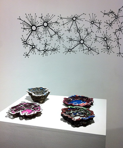
Back in September I showed a little work called Local Colour at ISEA 2011. This project continues my thinking about generative systems, materiality and fabrication. It's a work in two parts: the first is a group of laser-cut cardboard bowls, made from reclaimed produce boxes - you can see more on Flickr, and read the theoretical back-story in the ISEA paper. Here I want to briefly document the second element, a sort of network diagram realised as a vinyl-cut transfer. The diagram was created using a simple generative system, initially coded Processing - it's embedded below in Processing.js form (reload the page to generate a new diagram).

Network diagrams are one of the most powerful visual tropes in contemporary digital culture. Drawing on the credibility of network science they promise a paradigm that can be used to visualise everything from social networks to transport and biological systems. I love how they oscillate between expansive significance and diagrammatic emptiness. In this work I was curious to play with some of the conventions of small world or scale-free networks. A leading theory about how these networks forms involves preferential attachment: put simply it states that nodes entering a network will prefer to connect to those nodes that already have the most connections. In visualising the resulting networks, graph layout processes (such as force direction) use the connectivity between nodes to reposition the nodes themselves; location is determined by the network topology.
This process takes the standard small-world-network model and changes a few basic things. First, it assigns nodes a fixed position in space. Second, it uses that position to shape the connection process: here, as in the standard model, nodes prefer to connect to those with lots of existing connections. But distance also matters: connecting to a close node is "cheaper" than connecting to a distant one. And nodes have a "budget" - an upper limit on how far their connection can reach. These hacks result in a network which has some small world attributes - "hubs" and "clusters" of high connectivity - but where connectivity is moderated by proximity. Finally, this diagram visualises a change in one parameter of the model, as the distance budget decreases steadily from left to right. It could be a utopian progression towards a relocalised future, or the breakdown or dissolution of the networks we inhabit (networks in which distance remains, for the time being, cheap enough to neglect).
The process running here generates the diagram through a gradual process of optimisation. Beginning with 600 nodes placed randomly (but not too close to any other), each node is initially assigned a random partner to link to. Then they begin randomly choosing new partners, looking for one with a lower cost - and cost is a factor of both distance and connectivity. The Processing source code is here.


No comments:
Post a Comment