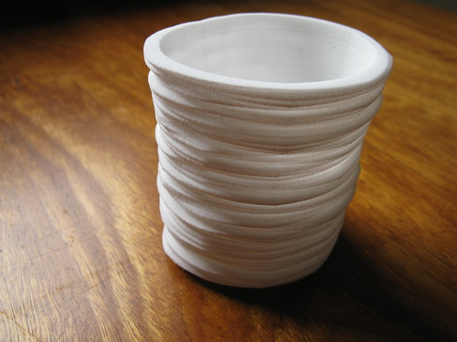
Showing posts with label projects. Show all posts

Thursday, December 04, 2014

Generative Heritage - notes on Succession


I spent three months this year on sabbatical at Culture Lab, Newcastle University (UK). It was a privelege to spend time in such a vibrant research lab, as well as to get to know the city of Newcastle. One of the projects to come out of my visit is Succession, an experiment in generative digital heritage that uses Newcastle and its history to think about industrialisation, global capital, our shared pasts and potential futures. Personally, it brings together two strands of my work that have been separate until now - on generative systems and digital cultural collections. Hence you'll also find this cross-posted over on The Visible Archive. Here, some notes and documentation on the work, some musings on generative and computational heritage.

Much of my recent work with digital cultural collections has worked to create rich representations of these ever-expanding datasets. A key thread has been an interest in the complexity of these collections; the multitudes they contain, their wealth of potential meaning as complex, interrelated wholes, rather than simply respositories of individual resources. Visualisation can provide a macroscopic view of this complexity, but it can be just as vivid when sampled at a micro scale. Tim Sherratt's Trove News Bot tweets digitised newspaper articles in response to the day's news headlines, creating little juxapositions, timely sparks of meaning that can be pithy, funny, or provocative. Trove News Bot appropriates the twitter bot - the joking-but-deadly-serious computational voice of our age - and adapts it to work with the digital archive. We could call this generative heritage; using computational processes to create new artefacts (and meanings) from historical material.

Succession applies this generative approach to the digital heritage of Newcastle Upon Tyne. Newcastle has a rich industrial heritage; it played a major role in the Industrial Revolution that began in Britain and went on to remake global civilisation. Today Newcastle is a post-industrial or de-industrialised city: coal, steel and shipbuilding have given way to service industries: education, retail, entertainment and tourism. As an outsider exploring the city I was struck by the mixture of pre-modern, industrial and post-industrial eras in the fabric of the city. Different (often inconsistent) patterns of life, work and economy are accreted in layers as the city continues the everyday process of adaptation, experimentation with the possible; working out what comes next.


The city, like the digital archive, is a multitude; an unthinkably complex matrix of people, things, systems, narratives. Newcastle - more than many other cities - also speaks to the expansive dynamics of industrialisation, globalisation, extractive industry, fossil fuels; the whole modern trajectory that has brought us to our current predicament. This seems to be both urgent and unthinkable - or perhaps, unsayable. How can we speak back to this complexity; how can we make in a way that responds to this tangled, expansive mess? Here generative techniques offer a way to synthesise complexity and create multitudes, formations that might portray the city as it was, or hint at what it could be. Automatic juxtaposition and remix create nonsense but also, occasionally, glimmers of a new sense, or at least a texture or sensation that emerges from a random constellation of images, sources and contexts. Succession requires us to piece together fragments of history; and this is a work of imagination, as Ross Gibson writes, framing his own work of generative heritage (with Kate Richards, Life After Wartime

Our parlous states need imagination. We need to propose “what if” scenarios that help us account for what has happened in our habitat so that we can then better envisage what might happen. We need to apprehend the past. Otherwise, we won’t be able to align ourselves to historical momentum. Without doing this we won’t be able to divine the continuous tendencies that are making us as they persist out of the past into the present.

In practical terms, the work is based on a corpus of around two thousand images sourced from the Flickr Commons. Most come from the (wonderful) Tyne and Wear Archives and Museums collection; many more from the Internet Archive Books collection, with a smattering of others from UK and international institutions. Succession uses these ingredients to generate new digital "fossils"; composite images assembled in the browser using HTML Canvas. This generative process is extremely simple: pick five sources at random, and place them in the frame using some semi-random rules for positioning, compositing and repetition. Opacity is kept low, so that the sources blend and merge. The visual process often obscures the source images - they end up buried,  cropped or indistinguishable, squashed like fossil strata. But at the same time the source items are preserved and presented in context, so each composite retains references to its sources and their attendant contexts. Composites can be saved, acquiring an ID and permalink; the images in this post show some of my favourites, but there are over a hundred to sift through already.


As a generative system this is, in formal terms, incredibly simple. It's essentially a combinatorial process, in that each composite consists of five elements from a set of around two thousand. Yet already this adds up to 2.5 x 10^15 unique combinations - it would take eight million years to see them all, at one per second. Compositing and layout parameters are random within constraints - so this simple machine can produce an immense variety of unique results; I'm still surprised and delighted by the fossils people discover (or generate). But this computational variety is also strongly shaped by the human creative choices involved in making the work. This is what Bill Seaman (combinatorial media artist par excellence) calls "authored space" - a domain of potential that is expansive but never arbitrary. The corpus reflects a handful of coherent themes, seasoned with generous sprinklings of the lateral and miscellaneous; the aim is, in Seaman's words, a kind of "resonant unfixity." Also the corpus and the compositing process work in tandem; for example compositor treats the largely monochrome line-art and engravings of the Internet Archive material differently to other (largely photographic) sources. The generative machine is programmed in part by the textures and qualities of its material.


The Internet Archive book images are interesting on several fronts; for one, they are an amazing demonstration of the power of computational processes for generating and describing large collections (like 2.6 million items large). Given the right kind of source material, this computational leverage changes the logic of collections completely. When adding and describing items is expensive, it makes sense to be selective, and publish only what is most "significant". Automation makes it possible to simply publish everything - for who's to say (really) what is significant, or how it might one day be significant? In Succession the Internet Archive material plays a crucial role. The line art and diagrams - many from obscure publications like the Transactions of the North of England Institute of Mining and Mechanical Engineers - offer evocative fragments of the machinery of mid-nineteenth century industrialisation.

As for generative digital heritage, it's a fairly open-ended proposal. What happens when we turn algorithms loose on our digital culture with makerly, synthetic, speculative or poetic intention? There are some pretty solid precedents in the digital humanities for these approaches; Schnapp and Presner call for a "generative" DH in their 2009 manifesto. Before that Drucker and Nowviskie outlined a "speculative computing" with a strongly generative flavour. Gibson and Richards' Life After Wartime is an early exemplar of generative heritage in the digital arts. More recently we've seen the rise of massive online collections, web-scale computing, and a proliferation of cultural, critical and creative bots, not to mention projects like #NaNoGenMo. If there is such a thing as generative digital heritage, then now's the time.

Read More...

Tuesday, February 07, 2012

Local Colour: Smaller World Network

Back in September I showed a little work called Local Colour at ISEA 2011. This project continues my thinking about generative systems, materiality and fabrication. It's a work in two parts: the first is a group of laser-cut cardboard bowls, made from reclaimed produce boxes - you can see more on Flickr, and read the theoretical back-story in the ISEA paper. Here I want to briefly document the second element, a sort of network diagram realised as a vinyl-cut transfer. The diagram was created using a simple generative system, initially coded Processing - it's embedded below in Processing.js form (reload the page to generate a new diagram).

Local Colour at ISEA 2011
Network diagrams are one of the most powerful visual tropes in contemporary digital culture. Drawing on the credibility of network science they promise a paradigm that can be used to visualise everything from social networks to transport and biological systems. I love how they oscillate between expansive significance and diagrammatic emptiness. In this work I was curious to play with some of the conventions of small world or scale-free networks. A leading theory about how these networks forms involves preferential attachment: put simply it states that nodes entering a network will prefer to connect to those nodes that already have the most connections. In visualising the resulting networks, graph layout processes (such as force direction) use the connectivity between nodes to reposition the nodes themselves; location is determined by the network topology.


This process takes the standard small-world-network model and changes a few basic things. First, it assigns nodes a fixed position in space. Second, it uses that position to shape the connection process: here, as in the standard model, nodes prefer to connect to those with lots of existing connections. But distance also matters: connecting to a close node is "cheaper" than connecting to a distant one. And nodes have a "budget" - an upper limit on how far their connection can reach. These hacks result in a network which has some small world attributes - "hubs" and "clusters" of high connectivity - but where connectivity is moderated by proximity. Finally, this diagram visualises a change in one parameter of the model, as the distance budget decreases steadily from left to right. It could be a utopian progression towards a relocalised future, or the breakdown or dissolution of the networks we inhabit (networks in which distance remains, for the time being, cheap enough to neglect).

The process running here generates the diagram through a gradual process of optimisation. Beginning with 600 nodes placed randomly (but not too close to any other), each node is initially assigned a random partner to link to. Then they begin randomly choosing new partners, looking for one with a lower cost - and cost is a factor of both distance and connectivity. The Processing source code is here.

Read More...

Sunday, June 06, 2010

Measuring Cup

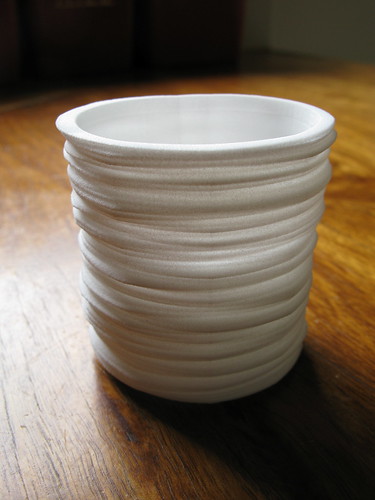
Measuring Cup is a little dataform project I've been working on this year. It's currently showing in Inside Out, an exhibition of rapid-prototyped miniatures at Object gallery, Sydney.

This form presents 150 years of Sydney temperature data in a little cup-shaped object about 6cm high. The data comes from the UK Met Office's HadCRUT subset, released earlier this year; for Sydney it contains monthly average temperatures back to 1859.


The structure of the form is pretty straightforward. Each horizontal layer of the form is a single year of data; these layers are stacked chronologically bottom to top - so 1859 is at the base, 2009 at the lip. The profile of each layer is basically a radial line graph of the monthly data for that year. Months are ordered clockwise around a full circle, and the data controls the radius of the form at each month. The result is a sort of squashed ovoid, with a flat spot where winter is (July, here in the South).


The data is smoothed using a moving average - each data point is the average of the past five years data for that month. I did this mainly for aesthetic reasons, because the raw year-to-year variations made the form angular and jittery. While I was reluctant to do anything to the raw values, moving average smoothing is often applied to this sort of data (though as always the devil is in the detail).


The punchline really only works when you hold it in your hand. The cup has a lip - like any good cup, it expands slightly towards the rim. It fits nicely in the hand. But this lip is, of course, the product of the warming trend of recent decades. So there's a moment of haptic tension there, between ergonomic (human centred) pleasure and the evidence of how our human-centredness is playing out for the planet as a whole.


The form was generated using Processing, exported to STL via superCAD, then cleaned up in Meshlab. The render above was done in Blender - it shows the shallow tick marks on the inside surface that mark out 25-year intervals. Overall the process was pretty similar to that for the Weather Bracelet. One interesting difference in this case is that consistently formatted global data is readily available, so it should be relatively easy to make a configurator that will let you print a Cup from your local data.

Read More...

Sunday, August 23, 2009

Tiny Sketching

As a kind of test pattern to fill the current break in transmission, here are my contributions to Tiny Sketch, an OpenProcessing / Rhizome competition (open until mid September) for Processing sketches under 200 characters.

In Bit Sunset I just load the pixels[] array, pick a random block of pixels, and add a large number to their value. This process throws up some surprising results as the colour values gradually increase, then start pushing into the alpha bits of the ARGB integer; eventually, as it fills the alpha bits, it settles into a pallette of pinks and greens that are gradually smashed into pixel-dust.


Albers Clock was an attempt to slow the pace of TinySketch even further; it visualises the current time in the form of an Albers square, with three colours, one each for hour, minute and second. I also like that it creates an image that is synchronous (within timezones, at least), unlike the asynchronous, individualised runtimes of most sketches.


There are dozens of amazing sketches in this collection - it's a fascinating microcosm (in every sense) of the current Processing / generative / code art scene. Given the tight constraints it's not surprising to see some demoscene virtuousity in the code - like Martin Schneider's Sandbox, a physical simulation painting app in 200 characters. There is also some classic software art conceptualism and reflexivity - like Jerome St Clair's Joy Division cover and Kyle MacDonald's Except. Great to see projects like this - and OpenProcessing itself - reviving applet culture in an open source, web2.0-flavoured way.

Read More...

Sunday, March 15, 2009

Watching the Street (Navigator) / citySCENE

Vague Terrain 13: citySCENE has just launched. As editor Greg J. Smith writes:

This issue of Vague Terrain is founded on two notions - that the city is a stage set for intervention and an engine for representation.
The collection expands out from this premise in multiple directions: carto-mashups, projection-bombing, sound walks, psychogeographic imaging and ubicomp experiments. Early highlights for me included Crisis Fronts' Cognitive Maps and Database Urbanisms, which presents some impressive work on data visualisation and generative models as urban mapping strategies (below: Case Study: Los Angeles). Overall, on a first look, this collection is incredibly rich. It shows that a creative, wired-up, critical urbanism is not just a wisftul aspiration of the technorati, but a real practice.


Having said all that, it's a privelege to be a part of this collection. My contribution is Watching the Street (Navigator), a browsable visualisation of a single day of images from the Watching the Street dataset. It tests out the hunch that these time-lapse slit-scans can be used to read real patterns in the urban environment - that they are (or can be) more than just suggestive abstractions. It uses a simple interface to display both a single source frame, and a correlated slit-scan visualisation, with image-space and time-space sharing an axis, a bit like a slide rule. Greg Smith called it an "urban viewfinder", which sums the intention up nicely.


Playing with the navigator for a while seems to confirm that hunch. The composites reveal temporal patterns in the environment, but not the spatial context that allows us to identify their causes; the source frames show that spatial context, but not the change over time. Reading the two against each other involves chains and cycles of discovery, analysis and inference. These might be open-ended (spatiotemporal browsing) or more directed. What time do the sandwich-boards go out? How long does the delivery truck stay?

Building the navigator presented some interesting technical challenges: mainly, how to make a web-friendly interface to 1440 source frames (240 x 320) and 480 slit-scan composites (720 x 320). That adds up to about 75Mb of jpegs. Processing 1.0 came to the rescue, with its new built-in dynamic image loader. requestImage() pulls in an image from a given URL, on cue, without bringing the whole applet to a grinding halt; it provides some basic feedback on the state of that image - whether it's loading, loaded, or un-loadable. I also blundered into two other useful lessons: how to use the applet "base" parameter, and how to manage Java's local cache, which kept throwing up earlier versions of the applet during testing.

Having made a lean, mean, browser-friendly version, I'm now thinking of adapting the navigator into a full-screen, offline app, with the whole eight-day dataset, and perhaps some tools for annotation and intra-day comparison. Best of all would be a long term installation; a sort of urban space-time observatory, watching the street but also opening it up to ongoing interpretation. If you'd like it running in your foyer, let me know.

Read More...

Friday, January 16, 2009

JCSMR Curls

This post is (belated) documentation of a project I worked on in 2007-8, creating an audio-responsive generative system for a permanent installation for the Jackie Chan Science Centre (yes, that Jackie Chan) at the John Curtin School of Medical Research, on the ANU campus. Along with some Processing-related nitty gritty, you'll find some broader reflections on generative systems and the design process. For less process and more product, skip straight to the generative applets (and turn on your sound input).

In mid 2007 my colleague Stephen Barrass and I were approached by Thylacine, a Canberra company specialising in urban art, industrial and exhibition design. Caolan Mitchell and Alexandra Gillespie were designing a new permanent exhibition, the first stage of the new Jackie Chan Science Centre, housed in a new building - a razor-sharp piece of contemporary architecture (below) by Melbourne firm Lyons. Instead of just bolting a display case and a few plaques to the wall, Mitchell and Gillespie (wonderfully) proposed a design that hinged on a dynamic generative motif - a system that would ebb and flow with its own life cycles, and echo the spiral / helix DNA structures central to the School's work, and already embedded in the building's architecture.


My initial sketches (below) took the spiral motif fairly literally, drawing vertical helices and varying their width with a combination of mouse movement and a simple sin function - the results reminded me of the beautiful spiral egg cases of the Port Jackson Shark. At that stage we were talking about the possibility of projecting back onto the facade of the building, which has big vertical glass panels; this structure informed the vertical format. I made a quick video mockup of the form on the facade - which was incredibly easy, thanks to the robust, adaptable, extendable goodness of Processing (a recurring theme in the process to come).


These sketches meet the simplest criteria of the brief (spiral forms) but do nothing about the more interesting (and difficult) ones: cycles of birth, growth and death, and dynamics over multiple time scales. Over the next couple of months I developed two or three different approaches to this goal.

The phyllotaxis model blogged earlier was one attempt. Spurred on by the hardcore a-life skills of Jon McCormack and co. at CEMA, I built a system in which phyllotactic spirals self-organised spontaneously. Because in Jon's words, anyone can draw a spiral, what you really want is a system out of which spirals emerge! The model worked, but I had trouble figuring out how phyllotactic spiral forms might meaningfully die or reproduce. Also, by that stage I had two other systems that seemed more promising.

From the early stages I wanted to make the system respond to environmental audio. The installation would be in a public foyer with plenty of pedestrian traffic, so audio promised a way to tap in to the building's rhythms of activity at long time scales, as well as convey an instantaneous sense of live interaction. In the two most developed sketches audio plays a key role in the life cycle of the system.

One sketch moved into 2d, and started with a pre-existing model for growth, by way of the Eden growth algorithm (this system would later be adapted again into Limits to Growth). I had already been playing with an "off-lattice" Eden-like system where circular cells could grow at any angle to their parent (rather than the square grid of the original Eden model). This system also made it easy to vary the radius of those cells individually. The next step was to couple live audio to the system; following a physical metaphor, frequency is mapped to cell size, so that larger cells responded to low frequency bands, and smaller cells to high frequencies. Incoming sound adds to the cell's energy parameter; this energy gradually decays over time in the absence of sound. Cell reproduction, logically enough, is conditional on energy.


The result is that cells which are best "tuned" for the current audio spectrum will accumulate more energy, and so are more likely to reproduce, spawning a neighbour whose size (and thus tuning) is similar to, but not the same as, their own; so over time the system generates a range of different cell sizes, but only the well-tuned survive. The rest die, which in the best artificial life tradition, means they just go away - no mess, no fuss. In the image below cells are rendered with stroke thickness mapped to energy level. The curves and branches pop out of rules sprinkled lightly with random(), resulting in a loose take on the spiral motif, which is probably the weak point in this sketch. I still think it has potential - nightclub videowall, anyone? Try the live applet over here (adjust your audio input levels to control the growth / death balance).


The third model takes this approach to energy and reproduction - about the simplest possible a-life simulation - and folds it back into the helical structures of the first sketches. In this world an individual is a 3d helix, built from simple line segments. Again each individual is tuned to a frequency band, which supplies energy for growth; but here "growth" means adding segments to the helix, extending its length. Individuals can "reproduce", given enough energy, but here reproducing means spawning a whole new helix, with a slightly mutated frequency band. All the helixes grow from the same origin point - they form a colony, something like a clump of grass.


This sketch went through many variants and iterations over the next month or so; in retrospect the process of working to a brief, within a design team, pushed this system further than I ever would have taken it myself. At the same time I was testing the system against my own critical position; I've argued earlier that the generative model matters, not just for its generativity but the entities and relations it involves.


From that perspective this system was full of holes. Death was arbitrary: just a timer measuring a fixed life-span. "Growth" was a misnomer: the number of segments was simply a rolling average of the energy in the curl's frequency band, so the curls were really no more than slow-motion level meters. Taking the organic / metabolic analogy more seriously, I worked out a better solution. An organism needs a certain amount of energy just to function; and the bigger the organism, the more energy it needs. If it gets more than it needs, then it can grow; if it gets less than it needs, for long enough, it will die. So this is a simple metabolic logic that can link growth, energy and death. Translated into the world of the curls: for each time step, every curl has an energy threshhold, which is proportional to its size (in line segments); if the spectral energy in its band is far enough over that threshhold, it adds a segment - like adding a new cell to its body; if the energy is under that threshhold, it doesn't grow; and if it remains in stasis for too long, it dies. Funnily enough, the behaviour that results is only subtly different to the simple windowed average. Does the model really matter, in that case? It does for me at least; if and how it matters for others is another question.


Next, the curls developed a more complex life-cycle - credit to Alex Gillespie for urging me in this direction. In line with the grass analogy, curls grow a "seed" at their tip when they are in stasis; when they die, that seed is released into the world. Like real seeds, these can lie dormant indefinitely before being revived - here, by a burst of energy in their specific frequency band. After several iterations, the seed form settled on a circle that gradually grows spikes, all the while being blown back "down" the world (against the direction of growth) by audio energy (below). As well as adding graphic variety, seeds change the system's overall dynamics. Unlike spawned curls, seeds are genetically identical to their "parent" - attributes such as frequency band are passed on unaltered. Because each individual can make only one seed, that seed is a way for the curl to go dormant in lean times; if it gets another burst of energy, it can be reborn. The curls demo applet demonstrates this best (again, adjust your audio input and make some noise).


A few technical notes. One big lesson here was the power of transform-based geometry. Each curl is a sequence of line segments whose length relates to frequency band (lower tuned curls have longer segments); each segment is tilted (rotateZ), then translated along the x axis to the correct spot. A sine function is used to modulate the radius of each curl along its length; frequency band factors in here too; this radius is expressed as a y axis translation. Then the segment is rotated around the x axis, to give depth. I iterate this a few hundred times to get one curl, and repeat this process up to twenty times to draw the whole world - each curl has its own parameters for tilt, x rotation increment, and frequency band.

In the live applet audio energy ripples up the curls, from base to tip. This was added to reinforce the liveness of the system and add some rapid, moment-by-moment change. It was implemented very simply. I used a (Java) ArrayList to create a stack of audio level values; at each time step, the current audio level value is added at the head of the list, and the ArrayList politely shuffles all the other values along. So each segment's length is a combination of three values; the base segment length, a function to taper the curl towards the tip, and the buffered audio level.


The graphics are all drawn with OpenGL - following flight404 I dabbled with GL blend modes, specifically additive blending, to get that luminous quality. The other key visual device here is the smearing caused by redrawing with a translucent rect(); instead of erasing the previous frame completely this fades it before overlaying the new frame. It's an easy trick that I've used before. But as Tom Carden explains, in OpenGL it leaves traces of previous frames. I discovered this firsthand when Alex and Caolan asked whether we could lose the "ghosts." I was baffled: on my dim old Powerbook screen, I simply hadn't seen them. Eventually, juggling alpha values I could reduce the "ghosts" to almost black (1) against the completely black (0) background - but no lower. Finally I just set the initial background to (1) instead of (0), and the ghosts were gone.


The adaptability of Processing came through again when it came to realising the installation. The final spec was a single long custom-made display case, with three small, inset LCD panels. These screens would run slide shows expanding on the exhibition content, but also feature the generative graphics when idle; the case itself would also integrate the curls as a graphic motif. For the case graphics, I sent Thylacine an applet that output a PDF snapshot on a key press; they could generate the graphics as required, then import the files directly into their layout.

The screens posed some extra challenges. The initial idea was to have the screens switch between a Powerpoint slideshow, and the curls applet; but making this happen without window frames and other visual clutter was impossible. In the end it was easier to build a simple slide player into the applet: it reads in images from an external folder, allowing JCSMR to author and update the slideshow content independently.

So to wrap up the Processing rave: it provided a single integrated development and delivery tool for a project spanning print, screen, audio, interaction, animation and even content management. Being able to burrow straight through to Java is powerful. Development was seamlessly cross-platform; the whole thing was developed on a Mac, and now runs happily on a single Windows PC with three (modest) OpenGL video cards. The installation has run daily for over six months, without a hitch (touch wood).

Some installation shots below, though it's hard to photograph, being a glass fronted cabinet in a bright foyer - reflection city. I'll add some better shots when I can get them. If you're in Canberra, drop in to the JCSMR - worth it for the building alone - and see it in person.


And very finally, photographic proof of the Jackie Chan connection - image from The Age.

Read More...

Friday, December 19, 2008

Fabricated Growth Forms (Processing to Ponoko)

Like many others playing with generative techniques, I'm fascinated by the potential of digital fabrication. Getting beyond the screen and into the world of objects is a significant move for a field that has, until the last few years, reveled in its own immateriality. There's a lot to think about in this material turn, but that's for another post. Here, a quick report on my first experiment with generative fabrication.


I don't have a laser cutter handy at my workplace (though as William Turkel writes there are lots of good reasons why I should) so I decided to check out Ponoko; I wanted to see what was involved in generating, uploading and fabbing a small project. I started with the Processing sketch from Limits to Growth, and tweaked it to turn out much smaller forms (a few hundred nodes, rather than tens of thousands). I used the built-in PDF export, then opened the PDFs in Illustrator. (Illustrator is the only commercial/proprietary software step in this process, so I'd be interested to hear of any alternatives). The forms are drawn as linked line segments of varying stroke widths. Ponoko needs an EPS with only the outside edge of this form, so I used Illustrator to merge it into a composite path, then set the stroke colour and width as instructed (0,0,255 and 0.001mm).


The upload to Ponoko took a few tries - I was getting some strange errors as their system failed to "see" the cutting paths on the template - but after some swift and cheerful technical assistance it all worked. Pricing was also trial and error; the first design I uploaded was more complex than these, and of course these branching forms pack a long cutting path into a small surface area. I simplified the design, packed four forms onto a sheet, and opted for 4mm ply rather than acrylic. Final cost including (expensive) shipping to Australia was about $A60 (currently around $US40). Not what I'd call cheap, but not prohibitive either. There are intricate discussions of the economics of the business - shipping, exchange rates, local vs global, etc - on the Ponoko forums.

Eighteen days later, they arrived. Novelty counts for a lot here, but still, I'm totally charmed by these objects. A few surprises, but all good: they are smaller and finer than I imagined, and they smell very slightly of charred wood (excellent!). The cut edges are dark with a nice smooth, burnished surface, and the ply surface is clean. The scale and intricacy of the things seems to entice people to touch and handle them. I find them far more satisfying than the (much more detailed) laser prints I made with the same system.


Immediately it's clear how the fabbing process, and the materials, can reach back up through the production chain and influence the design and the generative system. One flaw in the design is a product of how I'm drawing the shapes: there are small rounded "shoulders" at the joints between line segments, caused by the overlap between one rounded line cap and the next segment - this is obvious in the physical forms. Better to draw the segments as tapered rectangles, and avoid the shoulders. Also, the branching topology is structurally risky; how to introduce more joins without breaking the generative model? This interplay, between computational process, manufacturing process, material and form, seems really promising. Ponoko seems to be an excellent, affordable way to try this out, and the built-in fab-on-demand shopfront is great, if you want to sell your wares. But it's still, ironically, working with a mass-production paradigm of one design, n copies. With hooks for a more dynamic, generative front end, it could get really interesting: designers like the wonderful Nervous System are doing this already. More documentation of the growth forms over on Flickr.

Read More...

Thursday, November 27, 2008

Watching the Street

wts_out_1112
The recent Dorkbot show seemed to go off nicely - it was great to be part of such a strong show of local work (some documentation). I showed some prints from Limits to Growth, as well as a more experimental process piece, Watching the Street - a (sub)urban remake of Watching the Sky.


Credit to Nathan McGinness for the suggestion: use the same time-lapse / slit-scan technique to image change in an urban environment. Technically, the setup was fairly straightforward. Instead of a digital stills camera I used a webcam (in portrait orientation), and wrote a simple Processing script to save stills at one-minute intervals, while extracting and compiling one-pixel slices into 24-hour composites. The webcam was installed in a window box on the gallery street front, with a view across the road, under a street tree, to one of Manuka's low-rise shopping arcades (above). I also attached a printer to the installed rig, so that a new composite could be produced and pinned to the wall each day. So here, some of the resulting images, and a bit of commentary.

The image-gathering process got off to a rocky start. After a few hours, the webcam came unstuck from the side of the window-box, and lay forlornly on its side for the next 48 hours (here's what that looks like). I gaffed it back in place just before the opening, and restarted the capture in time to catch some gallery-goers loitering around out the front.

wts_out_1107
wts_out_1108
These two are the Frday the 7th and Saturday the 8th of November, the first two full day composites. Those striped rectangular chunks around mid-frame are cars, parked in the 30 minute loading zone accross the road. Some stay for a few minutes, a couple for what looks like an hour. Of course on the Saturday, the loading zone doesn't operate, and there's a single car parked in it from mid-morning to mid-afternoon. The single-pixel vertical shards give an indication of passing car and pedestrian traffic.

wts_out_1109
wts_out_1114
A quiet, sunny Sunday the 9th; the form hinted at on the 8th, reveals itself as the shadow of the big plane tree, creeping across the footpath. Then the following Friday the 14th. It's all happening; lots of car and pedestrian traffic, changes in sunlight, looks like an afternoon breeze in the foliage as well. The dominant, bluish horizontal stripe in all these images is the neon sign on the shopping centre - which runs all night. The orange rectangle that extends into the evening is the interior light of a shop - which you'll notice switches off at slightly different times each night.

So you'll notice that as in Watching the Sky, I'm persisting in reading these as visualisations of the environment, as well as digital images in themselves. I'm struck by how this simple, indiscriminate process reveals both expected and unexpected patterns, and continues to provoke new questions. This despite, or I would argue because of, its openness to multiple material / temporal systems. In an interesting bit of synchronicity, I was teaching in the UTS Street as Platform masterclass with Dan Hill (more on that soon) while this piece was running. Could a simple visualisation process like this function "informationally", as it were; to help answer real questions about a very specific slice of urban environment, in near-real time? More interesting for me, could it function in that way without prescribing the question in advance - that is, could it support an open-ended process of exploration and interpretation? I'm planning to build an interactive version of this piece, to try out these ideas. In these static visualisations there's a huge amount of data missing: I set the slice point more-or-less arbitrarily, so there are 479 other potentially interesting slices to browse. It would be nice to be able to change the slice point dynamically, as well as navigating through the source images. I notice that Processing 1.0 (yay!) now supports threaded loading of images: could come in handy. Meanwhile, the full set of composite images are up on Flickr.

Read More...

Monday, September 22, 2008

Limits to Growth

A new generative work that has just fallen into place; I'll be showing prints at the upcoming Dorkbot CBR show (CCAS Manuka, in November). Made with Processing. More will accumulate here.

ltg_lateral
Economic growth is a central tenet of contemporary capitalism; but the logic of endless growth seems increasingly difficult to sustain. Limits to Growth, published in 1972 (the year I was born), was commissioned by the Club of Rome to report on the economic implications of exponential growth, and used an abstract "world model" to predict the behaviour of the global economic system. This artwork experiments with growth in another model world: a simple generative system in the form of a computer program. In this two-dimensional system, growth has the ability to constrain itself, creating boundaries that define a formal and graphical whole. These forms are utopian diagrams of self-limiting growth.

Read More...

Wednesday, July 30, 2008

The Visible Archive

I signed the contracts thismorning on a research project that I'm really excited about: a grant from the National Archives of Australia to develop interactive visualisations of their collection. That collection has over nine million items, grouped into some thirty thousand series (or sets); it's basically all of the Federal government's paperwork, but also includes photographs, AV material and other stuff. You can search the collection via the Archives site - and access digital copies of the original records in some cases.

The Visible Archive aims to do what the search interface doesn't: provide a sense of context and orientation, revealing structures and relations within the collection. The visualisations should be useful for both archivists and archive users; and the techniques developed should also be useful for other archives and collections.


The idea seems to have some currency - you may have seen Lev Manovich recently announce a project on Visualizing Cultural Patterns, working with collaborators including Noah Wardrip-Fruin.

Read more and follow the project at its own, freshly minted blog. And if you have any pointers to other related work in the visualisation of cultural datasets, especially archives, please send them along.

Read More...

Thursday, July 03, 2008

Image, Data and Environment: Notes on Watching the Sky

Watching the Sky is a data visualisation project I've been working on for the past six months or so. The work is almost ridiculously simple: slit-scan type visualisations of large image time-series, shot from the window of my Canberra office. All the images from this process are up on Flickr. Recently UK journal Photographies invited me to write an "image led" piece on the work for their forthcoming second issue. Here's the essay, which looks at how we interpret, and literally image, pattern and change in the environment, and the role of data in that process. The themes (data, materiality, aesthetics) and some of the examples will be familiar to regular visitors. New things include spatiotemporal imaging (and even photography) as data visualisation, weather vs climate, black cockatoos, a quick look at art using environmental data-sources, and an equally quick dig at Tufte's Wavefields. It's also the most autobiographical bit of writing I've done in years - make of that what you will.

A few related projects that I discovered in the course of things: Miska Knapek's 24 hour visualisations, Michael Surtees'
36 Days of New York Sky, William Gaver's Video Window (pdf) - thanks Karl for the link - and yesyesnono's Travelling Around images - beautiful radial time-slices at a smaller time scale.

05.07_540


My childhood home was near an air force base on the outskirts of Sydney, where the sky was host to a wonderful array of aircraft. Mostly big, droning transports; Caribou and Hercules, each with their signature profiles and engine notes. Jets and helicopters were rarer and more prized: Mackie trainers, F-111s, Iroquois, Sikorskys and Chinooks. Once, miraculously, a visiting Starlifter transport, an immense silver thing apparently suspended over the hobby farms and horse paddocks. Unasked-for, revelatory, literally out of the blue, the planes were also metonymic signs of a wider world, and an idealised high-tech future I could barely wait for. Living signs flew over us too; we loved to think that black cockatoos were harbingers of rain, and would count them to predict the number of wet days ahead (image: Beppie K). I discovered the UFO lore of the early 80s; in dreams I was visited by terrifying lights, and saw archaic aircraft disintegrating above the eucalypt gully behind our house.


I came to Canberra from Sydney in early 2001, and the sky changed, opening out into a brilliant dome bounded by hills. Soon after it changed again as the nostalgic motif of the gliding passenger jet was overlain with catastrophe. This was echoed by strange weather, a long drought. Safe in suburbia, I installed a water tank and began watching the sky more hopefully, tracking rain bands and storm cells on the weather bureau's website: running out to clear the downpipes, then back to the laptop, downloading the latest. Sky data, almost real-time, a new and better harbinger, and with more at stake this time - water in the tank, a four thousand litre buffer against the next dry stretch. Never far away, the question of when weather becomes climate; is this a "blip" or a trend, short term variability or long term change? Temperature and rainfall statistics become common currency, and every month brings new data, but the more we know the less certain we become; in fact the only consensus seems to suggest more uncertainty. Ocean temperature measurements feed supercomputer models whose simulations are distilled into enticing, oracular suggestions, indications, projections. We occupy an increasingly detailed graph of accumulated data, but remain trapped inevitably in the present, at its right hand edge.

Watching the clouds approaching and cross-checking the weather radar, it's impossible not to sense the gaps and disjunctions between the data - an authorised, centralised and objective account of what is - and the situation "on the ground." This patch of rain that should be on us now, and somehow is not. It seems to have eluded the radar's view, slipped between the pixels or time-steps, or vanished in the lag, the aporia of almost-real-time which is the time data itself takes: to gather, check, validate, compile, visualise, distribute. The weather stubbornly continues to occur in the present, and at full resolution. The rainfall figures always come (as any weather watcher will know) from elsewhere, a single, notionally representative monitoring point. We're always cheated, as a result; overstated or undermeasured. Rain carries such social charge, where I live, that locals call the radio station, reporting from their backyard rain gauges in pyjamas and gumboots. This is the only way of closing that gap, to measure the world locally and create data instead of just siphoning it down from the web. I make my own measurements, tapping on the side of the tank slowly, bottom to top, listening for the hollow ring of the air cavity, homing in on the water level: data sonification.


In contemporary networked culture we are constantly reminded of the scale, ubiquity and significance of data. Every search, message, document, image, social exchange is a data transaction. We seem to be couched in data; it is our new environment. We accept this much-heralded "information overload" with more or less equanimity, as our inboxes and hard drives steadily fill. It's not surprising that in recent years artists and designers working in this domain have begun to grapple with data as a material. As I've argued elsewhere this inevitably involves the construction of an idea of what data is, what it's for, and what it contains. This practice also confronts the pragmatic question of what to do with data, what to make from it and (if we accept the value of the term) a data aesthetics.

One of the dominant creative strategies in this field, and its main aesthetic trope, is multiplicity: displays in which the points and lines of simple graphs burgeon into clouds, fields or flows. The datasets, and their visual figures, reflect our overloaded data-environment. This aesthetics of scale has been theorised through the notion of the sublime, a figure historically associated with nature's beautiful and/or terrible expanses; once again data takes the place of environment (see for example Manovich 2002 (doc) and Jevbratt 2004 (13Mb pdf)).

The data sublime is aesthetically expedient, as well as culturally resonant. Sheer scale generates visual richness as well as revealing patterns within datasets; yet the data points we see here are meagre and unmysterious in themselves. Each is a small cluster of symbols and parameters generated through a (social, cultural) process of selection, filtering, quantification and categorisation, in order to grasp some specific slice of the world in a certain way. When data swarms and flows with apparently inherent dynamics, it's easy to forget how data is created, or even that it is created. This is especially true when the data source is the network itself; self-referentiality gives an impression of self-sufficiency, again a world in which data is given, rather than made.


Countering this tendency a number of works draw in data from the physical environment "outside", and direct our attention back towards a space that is more familiar and more uncomfortable than the digital realm. For example Andrea Polli's work brings data from large spatial and temporal scales into the realm of experience, often in close collaboration with scientists; her Atmospherics project (2004) renders meteorological data gathered from a severe storm as a complex spatial soundscape. Heat and the Heartbeat of the City (2004) sonifies temperature data for New York City, beginning with data gathered during the 1990s, and presenting projections for future decades based on climate change modeling. More recently Bonding Energy, by Douglas Repetto and LoVid (2007, above), gathers data from custom-made sculptural devices measuring solar energy levels, and displays changing levels from multiple measuring sites in an animated visualisation. These works use data reflectively, and show a commitment to the "outside" that is their ultimate data source. However they are also limited by the structure of their material, which measures the world through a single value — temperature or solar radiation level. This single point, as telling as it is, seems somehow overdetermined: too much what it is, too tightly bound to an existing set of meanings and stories.

Photographic imaging, by comparison, gathers large amounts of complex data from the environment: many millions of numerical values with a rich set of spatial interrelations. The notion that the camera reveals the otherwise invisible, as in the work of Muybridge for example, mirrors the aims of data visualisation; yet this also reveals an important difference in these two practices. The reduced data of measurements such as temperature go to great lengths to exclude the extraneous. On the other hand photography, if we regard it as a form of data visualisation, often seems to welcome the extraneous, to embrace incursions, unexpected interactions or extra layers. This is not to claim the photographic image has some kind of special relation to reality, or that it isn't just as selective, intentional, and conditional as a temperature measurement; it's more a slight opening out of the field of view. The photograph can operate something like a geological core sample, selective but inclusive, a piece of whatever happens to be within the frame.

In the emergent field of (what I will call) space-time imaging, artists exploit the digital photographic image to reconfigure representations of the world. This work has a pre-digital ancestry in slit-scan photography and cinematic effects, but with the digital image it has expanded and proliferated (see Levin). Artists have begun to approach the image as a two-dimensional data field; they treat time by extension as a third conceptual axis, forming a three dimensional volume. This abstract structure is literalised in projects such as Alvaro Cassinelli's Khronos Projector (2005), where we can "push" parts of the image back in time. While the experience of the work hinges on the fleshing out of a spatial metaphor, its operation can be understood as interactive data visualisation: a technique for selecting and presenting data points from the image series. Other work, such as that of Australian artist Daniel Crooks, can also be understood laterally, I would argue, as data visualisation or re-visualisation. Crooks works with digital video source material and explores the de- and re-composition of the image in ways that deform space and time, but also, like other data practices, reveal their subjects anew . In "time slice" work such as Train 6 (2004) Crooks samples small segments of the time/image stack, revealing their raw edges, rather than trying to smoothly reconstitute the image. The discourse around this work tends to emphasise its (broadly familiar) agenda: reconfiguring perception, breaking down conventions of representation, and so on (see for example Doropoulos). Like Dziga Vertov before him, Crooks' subject matter is deliberately everyday (public transport, urban spaces), drawing attention back to this reflexive project. Yet at its most poignant, Crooks' work also reveals real patterns of movement and change in the world that it samples. It re-visualises reality, and in doing so it demonstrates the richness of the photographic time-series as data set.

05.02_540_radial
Watching the Sky is a deliberately simple-minded experiment. It uses the most basic techniques of slit-scan photography and related digital space-time work. Using a static digital camera tethered to a computer, I take images at three minute intervals; four hundred and eighty per day. The camera is in my office, pointing out the window with an unremarkable view of the neighbouring building, some trees, power lines, and the sky over west Belconnen. A simple script extracts a narrow vertical slice from each image, at the same location in the frame; then compiles those slices into a new image. In the rectangular visualisations the slices are tiled from left to right. In the radial visualisations slices are gradually rotated so that a twenty-four-hour period spans one complete revolution (the "seam" is at midnight).

Of course any number of other visualisation processes are possible. The digital space-time field illustrates many of the options, though this work often plays with the reconstitution of a transformed image, which was not my interest here. Slices are used as a simple way to compress days' worth of data into a single visual field, while preserving as much as possible the spatial relations within each frame. They also make for visualisations with a simple logic, readable as high density graphs.

In a strange inversion of this project, Edward Tufte, prominent theorist of information visualisation and design, recently called for a new generation of information graphics - "wavefields" - that match the data rate of high-definition video, showing "high-resolution, complex, multiple, animated statistical data-flows." Yet the video exemplars that Tufte uses to make this proposal are not "statistical data flows" but abstract shots from the physical environment: rippling reflections on water and undulating meadows. It's striking that Tufte turns to these environmental sources of visual pattern to mock up a more "intense" genre of abstract, statistical visualisation. Among other things, Watching the Sky attempts to demonstrate that this kind of informational density (and aesthetic intensity) is already immanent (it's just out the window).

I'm influenced here by the work of Lisa Jevbratt, an artist whose data visualisations have focused on the digital networks, but whose approach works against any simple notion of information. Here too density is increased to the point of saturation: with a large and multilayered dataset, Jevbratt's 1:1 (1999/2002) visualises the attributes of some 180,000 internet (IP) addresses sampled by the artist. The resulting images are startling and completely abstract, but not at all unstructured. Jevbratt describes the visualisations as "abstract reals", and "objects for interpretation, not interpretations." Instead of demonstrating the already known, or the answer to a preconceived question (information), Jevbratt's data works provoke, and perhaps answer, new questions; in the artist's words "hints, suggestions, and openings."


Although the data source in Watching the Sky is as tangible and unmysterious as possible, surprising hints and suggestions continue to appear. In one of the earliest sketches I found small but distinct variations in the "horizon" over the course of a day, and recurring on successive days. I eventually realised this was caused by the afternoon breeze, shifting foliage by a few pixels within the frame. The dataset here is a trace of a complex material field that in a sense visualises its own internal structure: the passage of a shadow across the ground appears as a recurring pattern, an enfolded or multiplexed representation of another set of material interactions. As a data source, the photographic image also cuts easily across categories and domains. In the rectangular visualisations presented here stripes of colour are visible towards the bottom of the frame. These are caused by cars, parked illegally under the trees; they form another ad-hoc graph that reflects human (cultural, institutional) calendars and cycles, though again they are intermingled with other scales and structures.

Time, and the perception of change, are central here. Like Jevbratt my hope is that these visualisations will be platforms for interpretation that can somehow augment our local, subjective, everyday practice of reading the environment. There's a yawning gap in our culture at the moment, between this experiential scale, and the long, slow-motion catastrophe we seem to be in. Weather watchers comment on the isobars, track the low pressure systems as they pass, speculate on ocean surface temperatures and the Southern Oscillation; like the black cockatoos each data point is an ambiguous sign that refers to a wider material system. This project is a straightforward response that proposes another way to image, and think, pattern and change in the environment.

This is a preprint of an article submitted for consideration in Photographies © 2008 Taylor and Francis; Photographies is available online here.

Read More...