I signed the contracts thismorning on a research project that I'm really excited about: a grant from the National Archives of Australia to develop interactive visualisations of their collection. That collection has over nine million items, grouped into some thirty thousand series (or sets); it's basically all of the Federal government's paperwork, but also includes photographs, AV material and other stuff. You can search the collection via the Archives site - and access digital copies of the original records in some cases.
The Visible Archive aims to do what the search interface doesn't: provide a sense of context and orientation, revealing structures and relations within the collection. The visualisations should be useful for both archivists and archive users; and the techniques developed should also be useful for other archives and collections.
The idea seems to have some currency - you may have seen Lev Manovich recently announce a project on Visualizing Cultural Patterns, working with collaborators including Noah Wardrip-Fruin.
Read more and follow the project at its own, freshly minted blog. And if you have any pointers to other related work in the visualisation of cultural datasets, especially archives, please send them along.
Wednesday, July 30, 2008
The Visible Archive
Wednesday, July 16, 2008
Radiohead's Data Melancholy
In case you missed it, Radiohead have gone all data-aesthetic with their latest video, House of Cards. What's more, it's fully zeitgeist-compliant, with open access and a call for re-visualisations of a quite massive dataset: hundreds of megabytes of spatial data gathered with various 3d laser-scanning rigs. If the download stats and early signs are anything to go on, we will be seeing much more of this dataset.
As well as being technically cool, the project is yet another sign of the increasing cultural prominence of data as both material and idea - in that sense, after Design and the Elastic Mind and Wired's "Petabyte Age", this is more of the same. But it's also something different, it seems to me. Like any other visualisation, House of Cards doesn't only use data, it presents a certain sense of what data is, means, and (crucially) feels like; and this is where it's different. The dominant narrative of data visualisation at the moment is informed by the networked optimism of web 2.0, where the social sphere, and increasingly the world as a whole, is unproblematically digitised; where more is more and truth, beauty, and commercial success all are immanent in the teeming datacloud.
House of Cards, by contrast, is a manifestation of data melancholy. Data here is low res, with a sketchy looseness of detail that evokes the gaps, the un-sampled points. This data is also abject or corrupt, the scanner intentionally jammed with reflective material, a bit like the metallic chaff used to confuse missile guidance systems. These glitches are familiar devices in electronic music and video, including Kid A-era Radiohead. However here the errors are very much in the data; they have migrated out of the music, which is human, organic and more or less intact here. This disjunction between failed data and the emotional, human domain is what characterises the data melancholy; it's illustrated beautifully at the end of House of Cards, with the "party scene" (one of Thom Yorke's ideas for the clip), a social scene decimated into abstract clouds of points. This theme also resonates across In Rainbows, especially in the closing track, Videotape: "this is one for the good days / and I have it all here, in red blue green." Here image data is again a sort of failed trace of an emotional reality, all that remains of "the most perfect day I've ever seen."
Yorke's other motif for House of Cards was "vaporisation," which is clear enough in the clip; I think its most effective in the final shots of the house; the earlier clips of Yorke disintegrating seem a bit langurous, with that undulating look of Perlin noise (is it, anyone?). The house shot in particular reminded me of Brandon Morse's Preparing for the Inevitable; Morse's work in general has a related feel about it, though the models seem to be synthesised rather than sampled. Again the poetics is one of cool, digital melancholy, where tragedy is stripped down to a set of vectors and forces (above: Collapse, from Flickr). Here though, rather than a failure of data (sampled representation) it's a failure of the procedural model, or perhaps failure with, or in, the model.
Thursday, July 03, 2008
Image, Data and Environment: Notes on Watching the Sky
Watching the Sky is a data visualisation project I've been working on for the past six months or so. The work is almost ridiculously simple: slit-scan type visualisations of large image time-series, shot from the window of my Canberra office. All the images from this process are up on Flickr. Recently UK journal Photographies invited me to write an "image led" piece on the work for their forthcoming second issue. Here's the essay, which looks at how we interpret, and literally image, pattern and change in the environment, and the role of data in that process. The themes (data, materiality, aesthetics) and some of the examples will be familiar to regular visitors. New things include spatiotemporal imaging (and even photography) as data visualisation, weather vs climate, black cockatoos, a quick look at art using environmental data-sources, and an equally quick dig at Tufte's Wavefields. It's also the most autobiographical bit of writing I've done in years - make of that what you will.
A few related projects that I discovered in the course of things: Miska Knapek's 24 hour visualisations, Michael Surtees' 36 Days of New York Sky, William Gaver's Video Window (pdf) - thanks Karl for the link - and yesyesnono's Travelling Around images - beautiful radial time-slices at a smaller time scale.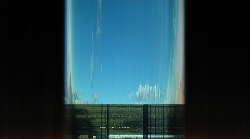
My childhood home was near an air force base on the outskirts of Sydney, where the sky was host to a wonderful array of aircraft. Mostly big, droning transports; Caribou and Hercules, each with their signature profiles and engine notes. Jets and helicopters were rarer and more prized: Mackie trainers, F-111s, Iroquois, Sikorskys and Chinooks. Once, miraculously, a visiting Starlifter transport, an immense silver thing apparently suspended over the hobby farms and horse paddocks. Unasked-for, revelatory, literally out of the blue, the planes were also metonymic signs of a wider world, and an idealised high-tech future I could barely wait for. Living signs flew over us too; we loved to think that black cockatoos were harbingers of rain, and would count them to predict the number of wet days ahead (image: Beppie K). I discovered the UFO lore of the early 80s; in dreams I was visited by terrifying lights, and saw archaic aircraft disintegrating above the eucalypt gully behind our house.
I came to Canberra from Sydney in early 2001, and the sky changed, opening out into a brilliant dome bounded by hills. Soon after it changed again as the nostalgic motif of the gliding passenger jet was overlain with catastrophe. This was echoed by strange weather, a long drought. Safe in suburbia, I installed a water tank and began watching the sky more hopefully, tracking rain bands and storm cells on the weather bureau's website: running out to clear the downpipes, then back to the laptop, downloading the latest. Sky data, almost real-time, a new and better harbinger, and with more at stake this time - water in the tank, a four thousand litre buffer against the next dry stretch. Never far away, the question of when weather becomes climate; is this a "blip" or a trend, short term variability or long term change? Temperature and rainfall statistics become common currency, and every month brings new data, but the more we know the less certain we become; in fact the only consensus seems to suggest more uncertainty. Ocean temperature measurements feed supercomputer models whose simulations are distilled into enticing, oracular suggestions, indications, projections. We occupy an increasingly detailed graph of accumulated data, but remain trapped inevitably in the present, at its right hand edge.
Watching the clouds approaching and cross-checking the weather radar, it's impossible not to sense the gaps and disjunctions between the data - an authorised, centralised and objective account of what is - and the situation "on the ground." This patch of rain that should be on us now, and somehow is not. It seems to have eluded the radar's view, slipped between the pixels or time-steps, or vanished in the lag, the aporia of almost-real-time which is the time data itself takes: to gather, check, validate, compile, visualise, distribute. The weather stubbornly continues to occur in the present, and at full resolution. The rainfall figures always come (as any weather watcher will know) from elsewhere, a single, notionally representative monitoring point. We're always cheated, as a result; overstated or undermeasured. Rain carries such social charge, where I live, that locals call the radio station, reporting from their backyard rain gauges in pyjamas and gumboots. This is the only way of closing that gap, to measure the world locally and create data instead of just siphoning it down from the web. I make my own measurements, tapping on the side of the tank slowly, bottom to top, listening for the hollow ring of the air cavity, homing in on the water level: data sonification.
In contemporary networked culture we are constantly reminded of the scale, ubiquity and significance of data. Every search, message, document, image, social exchange is a data transaction. We seem to be couched in data; it is our new environment. We accept this much-heralded "information overload" with more or less equanimity, as our inboxes and hard drives steadily fill. It's not surprising that in recent years artists and designers working in this domain have begun to grapple with data as a material. As I've argued elsewhere this inevitably involves the construction of an idea of what data is, what it's for, and what it contains. This practice also confronts the pragmatic question of what to do with data, what to make from it and (if we accept the value of the term) a data aesthetics.
One of the dominant creative strategies in this field, and its main aesthetic trope, is multiplicity: displays in which the points and lines of simple graphs burgeon into clouds, fields or flows. The datasets, and their visual figures, reflect our overloaded data-environment. This aesthetics of scale has been theorised through the notion of the sublime, a figure historically associated with nature's beautiful and/or terrible expanses; once again data takes the place of environment (see for example Manovich 2002 (doc) and Jevbratt 2004 (13Mb pdf)).
The data sublime is aesthetically expedient, as well as culturally resonant. Sheer scale generates visual richness as well as revealing patterns within datasets; yet the data points we see here are meagre and unmysterious in themselves. Each is a small cluster of symbols and parameters generated through a (social, cultural) process of selection, filtering, quantification and categorisation, in order to grasp some specific slice of the world in a certain way. When data swarms and flows with apparently inherent dynamics, it's easy to forget how data is created, or even that it is created. This is especially true when the data source is the network itself; self-referentiality gives an impression of self-sufficiency, again a world in which data is given, rather than made.
Countering this tendency a number of works draw in data from the physical environment "outside", and direct our attention back towards a space that is more familiar and more uncomfortable than the digital realm. For example Andrea Polli's work brings data from large spatial and temporal scales into the realm of experience, often in close collaboration with scientists; her Atmospherics project (2004) renders meteorological data gathered from a severe storm as a complex spatial soundscape. Heat and the Heartbeat of the City (2004) sonifies temperature data for New York City, beginning with data gathered during the 1990s, and presenting projections for future decades based on climate change modeling. More recently Bonding Energy, by Douglas Repetto and LoVid (2007, above), gathers data from custom-made sculptural devices measuring solar energy levels, and displays changing levels from multiple measuring sites in an animated visualisation. These works use data reflectively, and show a commitment to the "outside" that is their ultimate data source. However they are also limited by the structure of their material, which measures the world through a single value — temperature or solar radiation level. This single point, as telling as it is, seems somehow overdetermined: too much what it is, too tightly bound to an existing set of meanings and stories.
Photographic imaging, by comparison, gathers large amounts of complex data from the environment: many millions of numerical values with a rich set of spatial interrelations. The notion that the camera reveals the otherwise invisible, as in the work of Muybridge for example, mirrors the aims of data visualisation; yet this also reveals an important difference in these two practices. The reduced data of measurements such as temperature go to great lengths to exclude the extraneous. On the other hand photography, if we regard it as a form of data visualisation, often seems to welcome the extraneous, to embrace incursions, unexpected interactions or extra layers. This is not to claim the photographic image has some kind of special relation to reality, or that it isn't just as selective, intentional, and conditional as a temperature measurement; it's more a slight opening out of the field of view. The photograph can operate something like a geological core sample, selective but inclusive, a piece of whatever happens to be within the frame.
In the emergent field of (what I will call) space-time imaging, artists exploit the digital photographic image to reconfigure representations of the world. This work has a pre-digital ancestry in slit-scan photography and cinematic effects, but with the digital image it has expanded and proliferated (see Levin). Artists have begun to approach the image as a two-dimensional data field; they treat time by extension as a third conceptual axis, forming a three dimensional volume. This abstract structure is literalised in projects such as Alvaro Cassinelli's Khronos Projector (2005), where we can "push" parts of the image back in time. While the experience of the work hinges on the fleshing out of a spatial metaphor, its operation can be understood as interactive data visualisation: a technique for selecting and presenting data points from the image series. Other work, such as that of Australian artist Daniel Crooks, can also be understood laterally, I would argue, as data visualisation or re-visualisation. Crooks works with digital video source material and explores the de- and re-composition of the image in ways that deform space and time, but also, like other data practices, reveal their subjects anew . In "time slice" work such as Train 6 (2004) Crooks samples small segments of the time/image stack, revealing their raw edges, rather than trying to smoothly reconstitute the image. The discourse around this work tends to emphasise its (broadly familiar) agenda: reconfiguring perception, breaking down conventions of representation, and so on (see for example Doropoulos). Like Dziga Vertov before him, Crooks' subject matter is deliberately everyday (public transport, urban spaces), drawing attention back to this reflexive project. Yet at its most poignant, Crooks' work also reveals real patterns of movement and change in the world that it samples. It re-visualises reality, and in doing so it demonstrates the richness of the photographic time-series as data set.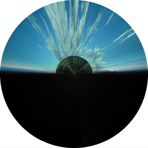
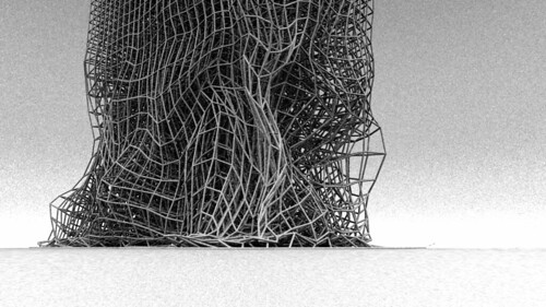
Watching the Sky is a deliberately simple-minded experiment. It uses the most basic techniques of slit-scan photography and related digital space-time work. Using a static digital camera tethered to a computer, I take images at three minute intervals; four hundred and eighty per day. The camera is in my office, pointing out the window with an unremarkable view of the neighbouring building, some trees, power lines, and the sky over west Belconnen. A simple script extracts a narrow vertical slice from each image, at the same location in the frame; then compiles those slices into a new image. In the rectangular visualisations the slices are tiled from left to right. In the radial visualisations slices are gradually rotated so that a twenty-four-hour period spans one complete revolution (the "seam" is at midnight).
Of course any number of other visualisation processes are possible. The digital space-time field illustrates many of the options, though this work often plays with the reconstitution of a transformed image, which was not my interest here. Slices are used as a simple way to compress days' worth of data into a single visual field, while preserving as much as possible the spatial relations within each frame. They also make for visualisations with a simple logic, readable as high density graphs.
In a strange inversion of this project, Edward Tufte, prominent theorist of information visualisation and design, recently called for a new generation of information graphics - "wavefields" - that match the data rate of high-definition video, showing "high-resolution, complex, multiple, animated statistical data-flows." Yet the video exemplars that Tufte uses to make this proposal are not "statistical data flows" but abstract shots from the physical environment: rippling reflections on water and undulating meadows. It's striking that Tufte turns to these environmental sources of visual pattern to mock up a more "intense" genre of abstract, statistical visualisation. Among other things, Watching the Sky attempts to demonstrate that this kind of informational density (and aesthetic intensity) is already immanent (it's just out the window).
I'm influenced here by the work of Lisa Jevbratt, an artist whose data visualisations have focused on the digital networks, but whose approach works against any simple notion of information. Here too density is increased to the point of saturation: with a large and multilayered dataset, Jevbratt's 1:1 (1999/2002) visualises the attributes of some 180,000 internet (IP) addresses sampled by the artist. The resulting images are startling and completely abstract, but not at all unstructured. Jevbratt describes the visualisations as "abstract reals", and "objects for interpretation, not interpretations." Instead of demonstrating the already known, or the answer to a preconceived question (information), Jevbratt's data works provoke, and perhaps answer, new questions; in the artist's words "hints, suggestions, and openings."
Although the data source in Watching the Sky is as tangible and unmysterious as possible, surprising hints and suggestions continue to appear. In one of the earliest sketches I found small but distinct variations in the "horizon" over the course of a day, and recurring on successive days. I eventually realised this was caused by the afternoon breeze, shifting foliage by a few pixels within the frame. The dataset here is a trace of a complex material field that in a sense visualises its own internal structure: the passage of a shadow across the ground appears as a recurring pattern, an enfolded or multiplexed representation of another set of material interactions. As a data source, the photographic image also cuts easily across categories and domains. In the rectangular visualisations presented here stripes of colour are visible towards the bottom of the frame. These are caused by cars, parked illegally under the trees; they form another ad-hoc graph that reflects human (cultural, institutional) calendars and cycles, though again they are intermingled with other scales and structures.
Time, and the perception of change, are central here. Like Jevbratt my hope is that these visualisations will be platforms for interpretation that can somehow augment our local, subjective, everyday practice of reading the environment. There's a yawning gap in our culture at the moment, between this experiential scale, and the long, slow-motion catastrophe we seem to be in. Weather watchers comment on the isobars, track the low pressure systems as they pass, speculate on ocean surface temperatures and the Southern Oscillation; like the black cockatoos each data point is an ambiguous sign that refers to a wider material system. This project is a straightforward response that proposes another way to image, and think, pattern and change in the environment.
This is a preprint of an article submitted for consideration in Photographies © 2008 Taylor and Francis; Photographies is available online here.


